Excel Dynamic Operations Dashboard
The Challenge
A financial services company had operational and profitability data spread across multiple systems and spreadsheets. Each week, someone spent hours pulling numbers together manually to prepare management reports. The process was slow, but the bigger problem was more fundamental: managers didn't always agree on what the numbers were.
Different people were pulling data from different sources, applying different calculations, and arriving at different conclusions. Meetings that should have been about decisions turned into debates about whose numbers were right. There was no single, authoritative view of how the business was performing.
Management needed a tool that would focus attention on what mattered each week, present one agreed-upon set of numbers, and let managers investigate the data themselves rather than waiting for analysts to produce ad-hoc reports.
The Solution
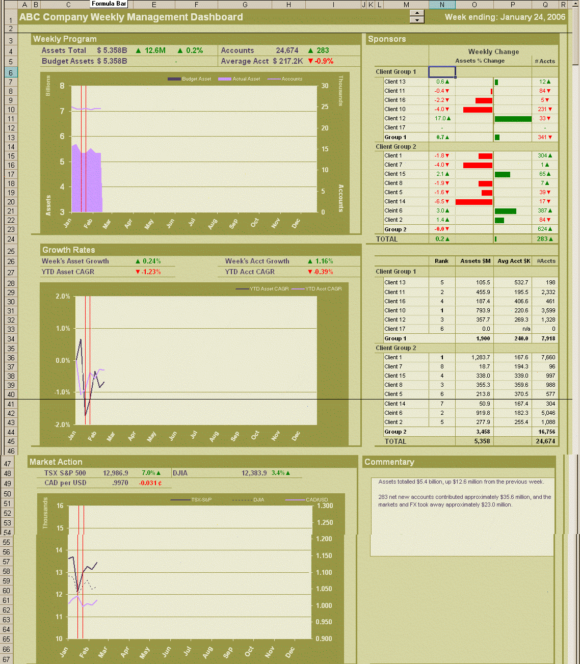
We designed and built a dynamic weekly management dashboard in Excel that served as the single source of truth for the business:
One Source of Truth
All key operational and profitability figures drawn from the same underlying data, calculated the same way, every week. No more conflicting numbers in meetings.
Automated Analysis
Week-over-week changes calculated and highlighted automatically. Budget variances, trend indicators, and exception flags surface what needs attention without manual effort.
Drill-Down Capability
Managers could slice and dice the data themselves — filtering by product, region, time period, or metric — to investigate issues without waiting for someone to build a custom report.
Management Commentary
Built-in commentary sections for narrative context alongside the numbers. The dashboard told the story of the week, not just the data.
The dashboard presented key operational figures and metrics through visual charts, KPI summaries, trend lines, and variance indicators — all refreshed with a single click from the source data.
The Results
- ✓ Hours of weekly report assembly replaced by a one-click refresh
- ✓ One agreed-upon set of numbers — meetings shifted from debating data to making decisions
- ✓ Managers could investigate the data themselves, reducing reliance on ad-hoc analyst requests
- ✓ Consistent, professional presentation every week — same format, same definitions, same source
- ✓ Issues surfaced automatically through variance and trend analysis rather than discovered by accident
Technology
Need a dashboard that tells the truth?
If your team is spending time debating numbers instead of making decisions, we can build a single source of truth that focuses management attention where it matters.
Get in Touch